November 2024 – May 2025
Internship at Stendahls

During my six months at Stendahls, I've had the opportunity to work on a range of projects, from building design systems and concepts from scratch to refining and adapting complex systems for large companies. ☺
What have I learned?
I’ve learned to navigate complex design systems, structure workflows, and adapt to rapid changes. Hands-on experience has strengthened my ability to present and justify design decisions, collaborate with developers, and manage deadlines. I’ve also deepened my understanding of Figma, iterative design, and the balance between creativity and practical constraints. Additionally, I’ve gained insight into my role as a digital designer within a team, honing my collaboration and problem-solving skills in a professional setting.
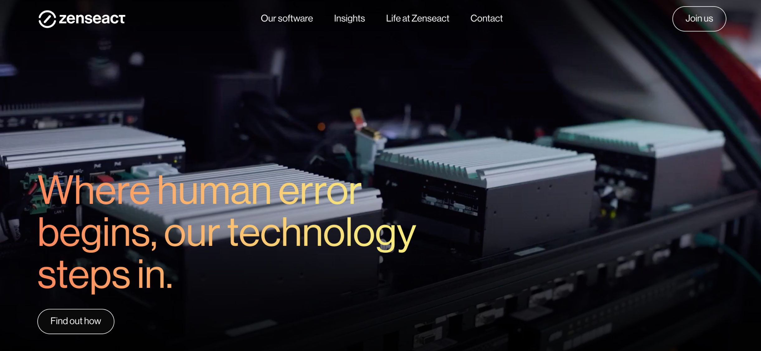
One of my key projects was the redesign of Zenseact’s website. Besides that, I've been involved in three projects with the agency's major clients. I also created design drafts for a pitch and took part in UX workshops to develop material for other pitches.
I’m unable to share most of these projects, as they haven’t gone live yet. But let's meet up for a coffee and I'll show you ☺
Zenseact
Redesign of website

Zenseact is a pioneering tech company working at the forefront of AI and autonomous driving safety. Our task was to redesign their website, with a strong focus on employer branding. The goal was to attract top talent, communicate Zenseact’s unique culture, and clarify their position as both a premium product provider and a thought leader in AI.
Background
Zenseact has a strong story to tell — but their previous website wasn’t helping them do that. They wanted the new site to better reflect who they are and what they stand for. One of the main goals of the redesign was to clearly communicate Zenseact’s mission throughout the site – both in structure and tone – and make this easy to grasp for different target audiences. In addition, the site needed an improved UX and a cohesive implementation of Zenseact’s visual identity — applied consistently across the site, while still helping the brand stand out from the crowd.
Solution
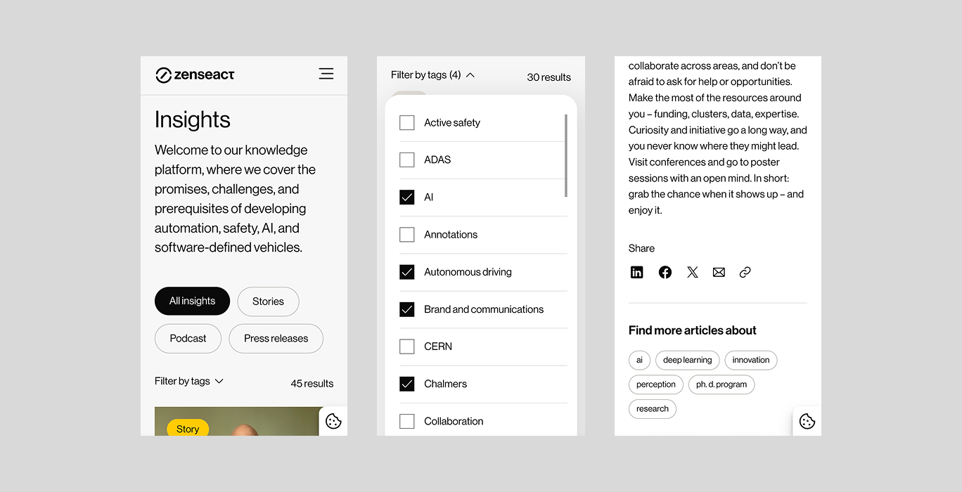
We designed a completely new website supported by a scalable design system. It brought visual consistency and allowed for a modular, flexible structure across pages. The new design highlights Zenseact’s position as an industry leader while creating space for storytelling around their technology, culture, and people.


My role in the team
As a design intern, I was involved throughout the full process – from early research and workshops to final handoff. My main responsibility was building the design system from the ground up in Figma. I defined and documented the core foundations, and built out a library of components and modules used across the site.
Beyond the design system, I also contributed to wireframes, page design, and developer handoff. The project gave me a chance to grow into a more confident and structured designer, while collaborating closely with senior designers and developers.
Beyond the design system, I also contributed to wireframes, page design, and developer handoff. The project gave me a chance to grow into a more confident and structured designer, while collaborating closely with senior designers and developers.
Yrgo x Grebbans
E-commerce product page

A fictional project conducted during a one-week workshop at Grebbans, where our group was tasked with creating an e-commerce product page for the fictional brand Echo Studios. The assignment had a strong focus on UX, with the data points provided. Our task was to develop a brand identity, rearrange and add data points, justify every design decision, and not remove any data points. The workshop culminated in a persuasive pitch.
Background
The problem we aimed to solve was creating a UX-focused product page that was both familiar and easy to navigate for the customer. At the same time, we were encouraged to think outside the box and innovate. Additionally, we needed to establish a visual identity for the brand Echo Studios.
Solution
Our solution was a mobile-view product page featuring a scrolling banner with USP details, product cards, prices, sizes, stock markers, product info in an accordion format, related products, and a footer. We branded Echo Studios as "sporty, exclusive, edgy." The color palette was minimalistic (black, white, grey), with the exception of our CTA color, "Tennis Green." We reflected our brand values in the choice of typography, icons, and layout.

My role in the team
I took the lead in developing the brand identity and creating a prototype with variables in Figma. Given the short project duration, collaboration was crucial. We spent considerable time on market analysis, as balancing customer recognition with innovative, edgy design was essential. We tested all colors for WCAG compliance and created components for every part of the prototype.
The shortfilm "Cows"
Film titles

How can I create film titles that are prominent enough to be interesting, without stealing attention from the film?
Background
As part of a school project, I created a proposal for the film titles of the short film Cows, produced by Bacon Pictures. The question I explored was: How can I create film titles that are prominent enough to be interesting, without stealing attention from the film?
Solution
I aimed to evoke an academic tone for the film by employing the traditional serif font Cormorant. To introduce contrast, I opted for the bold sans-serif font ACIER BAT. The producers sought a blend of tradition and intrigue.
The final result included the design of the film titles — both typography and layout — as well as animation, showing how the titles behave on screen.
The final result included the design of the film titles — both typography and layout — as well as animation, showing how the titles behave on screen.


Work
PERSONAL PROJECTS
After effects and Rive
Motion


.gif)

With a background in filmmaking, I find it thrilling to incorporate movement into my designs. I believe in the power of motion to emphasize key features and draw attention effectively.


